
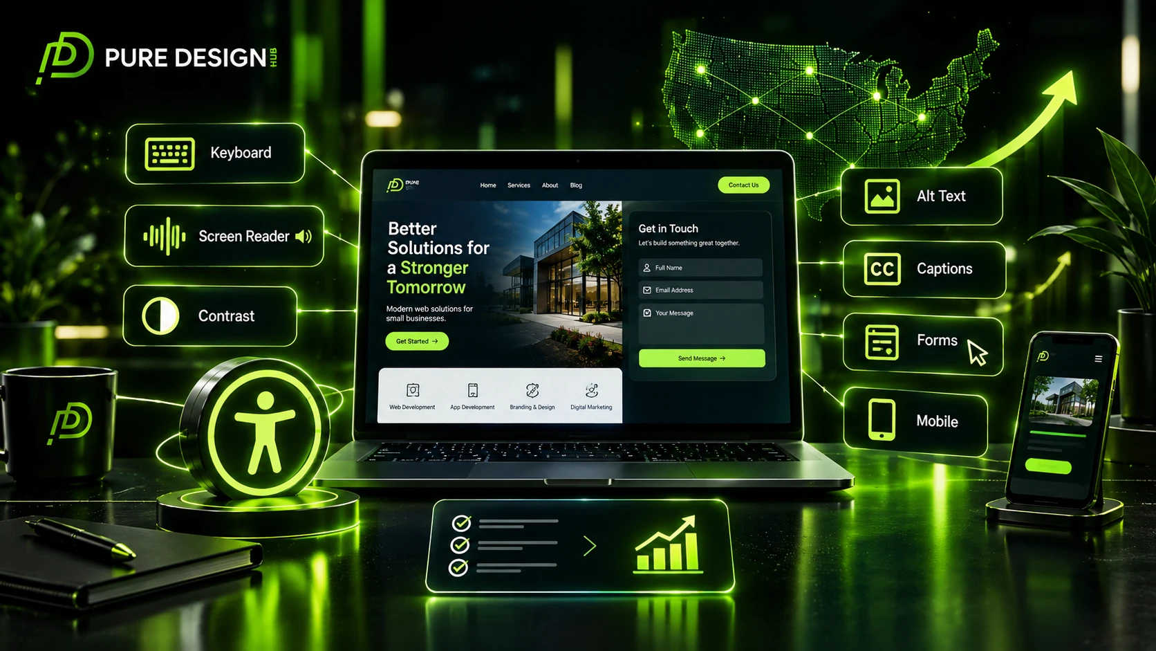



Your website may look great and still be difficult for some people to use.
Small issues can create big barriers. A visitor may struggle to read text, use a menu, fill out a form, or move around a page without a mouse.
That is why website accessibility should be part of modern web design and development.
For small businesses, accessibility is not only about making a site easier to use. It can also support a better user experience, clearer content, and stronger trust.
The current WCAG 2.2 standard provides guidance for making web content more accessible. It covers four main areas: perceivable, operable, understandable, and robust content.
This website accessibility checklist gives small businesses a simple starting point for reviewing their websites in 2026.
Important: This checklist is a practical starting point, not proof of legal compliance or full WCAG conformance.
What Is Website Accessibility?
Website accessibility means making a website easier for people with different abilities to use, understand, and navigate.
This includes people who may have visual, hearing, physical, speech, cognitive, or neurological disabilities. It also supports older users and people who face temporary or situational barriers.
An accessible website should make key tasks easier.
Visitors should be able to:
• Read your content
• Navigate your pages
• Use your forms
• Understand your links
• Use your website with different input methods
• Access important information on different devices
Good accessibility can also improve usability for many visitors, not just people with disabilities. W3C notes that accessibility guidance often improves general website usability as well.
Why Accessibility Matters for Small Businesses
A small business website has a simple job.
It needs to help people find information and take action.
If visitors cannot use your website easily, they may leave before reaching your services or contact page.
Accessibility can help you create a website that is:
Easier to use
Clearer to understand
More inclusive
Better prepared for different devices and users
It can also support a better customer experience from the first visit.
For a US small business, this matters because your website may be the first place a customer learns about your company, compares your services, or decides whether to contact you.
Website Accessibility Checklist
Use the following checks as a first review of your website.
1. Make Your Website Keyboard Friendly
Not every visitor uses a mouse.
A user should be able to move through important parts of your website with a keyboard.
Check your:
• Navigation menu
• Buttons
• Forms
• Links
• Popups
• Search tools
Make sure users can see where they are on the page as they move through interactive elements.
WCAG 2.2 includes guidance around keyboard access and focus behavior. Its newer criteria also address issues such as Focus Not Obscured and Dragging Movements.
2. Use Clear Heading Structure
Headings help visitors understand your page.
They also give assistive technology a better way to understand content structure.
Use:
One clear H1
Then logical H2 sections
Then H3 sections where needed.
Do not choose headings only because they look large.
Use them to organize meaning.
W3C recommends headings that clearly convey meaning and structure.
3. Write Useful Alt Text
Images should have meaningful text alternatives when they carry information.
For example, instead of:
image123.jpg
Use a useful description that explains the image.
Decorative images do not need unnecessary descriptions.
Good alt text should explain the image’s purpose rather than repeat keywords.
This is also a good reason to avoid keyword stuffing in image metadata.
4. Check Color Contrast
Text should be easy to read against its background.
This is especially important for:
• Small text
• Buttons
• Form labels
• Navigation
• Important instructions
A stylish color palette is not useful if people cannot read the content.
Accessibility should influence design decisions from the start.
5. Make Forms Easy to Complete
Forms are often where businesses lose potential leads.
Check your:
• Name fields
• Email fields
• Phone fields
• Dropdowns
• Checkboxes
• Error messages
Each field should have a clear label.
Errors should explain what went wrong and how to fix them.
This matters even more for contact forms because an inaccessible form can block a visitor from becoming a lead.
6. Use Descriptive Links
Avoid vague links such as:
Click here
Read more
Learn more
Use meaningful anchor text instead.
For example:
Explore our web development services
This gives visitors a clearer idea of where the link will take them.
W3C also recommends meaningful link text as part of accessible content writing.
7. Keep Focus States Visible
When someone uses a keyboard, they need to know which element is active.
A visible focus state can show whether the user is on:
• A menu item
• A button
• A form field
• A link
Do not remove focus outlines simply because they do not fit the design.
WCAG 2.2 added specific criteria around focus visibility and focus being obscured.
8. Make Your Website Work Well on Mobile
Accessibility is not limited to desktop screens.
People use phones and tablets in many different ways. Your website should support a strong mobile SEO experience while remaining easy to read, navigate, and interact with on smaller screens.
Check:
• Text size
• Button size
• Menu behavior
• Form fields
• Spacing
• Zoom
• Horizontal scrolling
WCAG applies to web content across desktop, tablet, and mobile experiences.
9. Keep Content Clear
Accessibility is also about language.
Avoid long blocks of text. Use short paragraphs, clear headings, descriptive links, and direct instructions.
For important pages, explain:
What the user needs to know
What they should do next
Where they can get help
W3C recommends keeping accessible content clear and concise.
10. Test Interactive Features
Do not only check your homepage.
Test the actions that matter to your business.
Try this simple journey:
Homepage → Service Page → Contact Form → Confirmation
Then test menus, buttons, popups, search, and other interactive elements.
A website can look accessible in a screenshot and still create problems during real use.
Accessibility Checks for US Small Business Websites
A practical review should connect accessibility with the needs of your actual customers.
| Website area | Why it matters for a US small business | What to check |
|---|---|---|
| Contact forms | Forms often create leads | Labels, errors, keyboard use |
| Service pages | Customers need clear information | Headings, contrast, readable content |
| Mobile pages | Many customers browse on phones | Buttons, menus, text size |
| Online booking | Users need a simple path to action | Keyboard access, instructions |
| Images | Visual content should remain useful | Accurate alt text |
| Navigation | Visitors need to find services quickly | Clear menus and focus states |
This is where accessibility becomes part of business focused web development, rather than a separate technical task.
WCAG 2.2 and Website Accessibility
WCAG 2.2 is the current W3C Recommendation for web accessibility. It contains 13 guidelines under four principles: Perceivable, Operable, Understandable, and Robust.
WCAG 2.2 also introduced nine additional success criteria compared with WCAG 2.1. These include areas such as target size, focus behavior, accessible authentication, and dragging movements.
There are three conformance levels:
- Level A
- Level AA
- Level AAA
Level AA includes all Level A and AA requirements. Many organizations use Level AA as a practical target.
For a small business, you do not need to start by reading every technical requirement.
Start with the basics.
Make your website readable, navigable, operable, and clear. Then use proper testing and professional review where needed.
How to Test Your Website Accessibility
A simple first review can start with manual testing.
Try using only your keyboard.
Increase the browser zoom.
Check your color contrast.
Open your forms.
Test your site on a phone.
Look at important images and their alt text.
Then use accessibility testing tools to find additional issues.
Remember that automated tools cannot identify every accessibility problem. Human testing still matters because a tool may detect a technical pattern without knowing whether a real user can complete the task.
A practical accessibility review should combine automated checks, manual testing, and real user feedback where possible.
Common Accessibility Mistakes
Small business websites often overlook simple issues such as:
• Missing or poor alt text
• Weak color contrast
• Unclear form labels
• Poor keyboard navigation
• Hidden focus states
• Vague link text
• Difficult mobile controls
• Complex instructions
• Inaccessible menus
Fixing these issues can make a website easier to use.
More importantly, accessibility should be considered before launch, not treated as a final repair task.
How Web Development Can Improve Accessibility
Accessibility works best when it starts during planning, design, and development.
Your team can consider accessibility when choosing:
Page structure
Navigation
Colors
Typography
Forms
Interactive elements
Mobile layouts
Content structure
Building these practices into a website is often more effective than trying to fix everything after launch.
For businesses planning a new site or a redesign website, accessibility can become part of the wider web development strategy.
Final Thoughts
A professional website should work for more people.
That starts with simple choices.
Clear content.
Useful links.
Readable text.
Keyboard access.
Good contrast.
Accessible forms.
Strong mobile usability.
You do not need to solve everything in one day.
Start with the most important pages. Find barriers. Fix them. Test again.
For businesses building a new website, accessibility should be part of the process from the beginning.
Need a website built with usability, accessibility, and performance in mind? Contact Pure Design Hub to discuss your web development project.
Frequently Asked Questions
Website accessibility means making a website easier for people with different abilities to use, understand, navigate, and interact with.
It can help more people use your website, improve the user experience, and make important actions such as forms and navigation easier.
WCAG 2.2 is the current W3C accessibility standard. It provides guidelines and testable requirements for making web content more accessible.
Start with keyboard navigation, text resizing, color contrast, forms, images, mobile layouts, and focus states. Then use accessibility testing tools for deeper checks.
No. A checklist is a useful starting point, but it does not prove legal compliance or full WCAG conformance. Professional testing may be needed.